
The selection of an investment is never an easy task and obviously involves some sort of due diligence. Often, this comprises a filtering process where investments from a particular universe are gradually removed until a handful of options are left to be chosen from.
What mathematical tools are available to further assist in the decision-making process from this point?
While you can’t extrapolate past performance into the future, all else being equal, past returns are a strong indicator of manager skill and clearly assist in building a high-quality portfolio.
Take for example the two funds below. They are both small cap funds and over a prolonged period of time, they have comprehensively outperformed their benchmark (the black line), the S&P/ASX Small Ordinaries Accumulation Index.
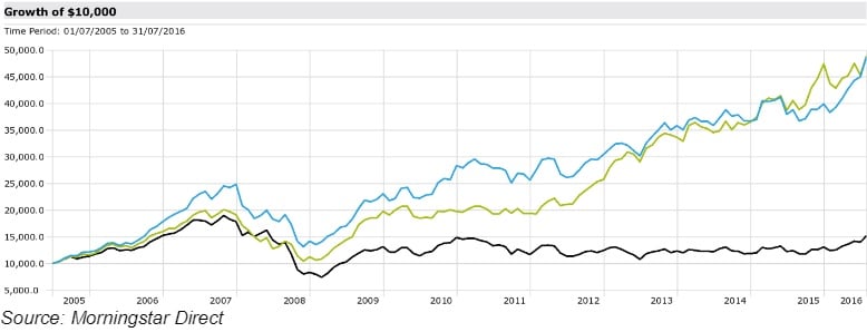
The performance of these two funds over a prolonged period of time (eleven years and one month) is incredibly close. However, it is impossible to make a decision based on returns alone, and irrespective of this, an investment should never be selected solely on past performance.
The following metrics can be used to assist in undertaking a mathematical analysis of managed fund performance.
Standard deviation
Standard deviation simply quantifies the degree of fluctuation in returns. It is probably used more often than any other measure to gauge risk. Standard deviation is liked as a measure because it provides a precise measure of how returns have varied over a particular time frame. The higher the standard deviation, the greater the fluctuations from the average return.
Incredibly, the standard deviation of the investments shown above is remarkably similar. The blue investment is 17.27 per cent per annum while the green investment is 16.95 per cent per annum. Pleasingly, both have a level of standard deviation much lower than that of the benchmark (19.11 per cent). Therefore, both have managed to outperform their benchmark with a lower level of risk, putting them in the ‘upper left quadrant’ (higher returns but with a lower level of risk).
These data points can be of significant assistance in confirming the qualitative due diligence. For example, if a manager has described their process as being one that is relatively conservative, but has a much higher standard deviation over a meaningful period of analysis, you would perhaps have to ask the manager some further questions.
Upside/downside capture
The upside/downside capture ratios can illustrate whether a given investment has on average outperformed or underperformed its benchmark during periods of market strength and weakness.
Some research houses calculate the upside capture ratio by taking the fund’s monthly return during months when the benchmark had a positive return and dividing it by the benchmark return during that same month. Conversely, the downside capture ratio is calculated by taking the fund’s monthly return during the periods of negative benchmark performance and dividing it by the benchmark return.
In the example above, this is where we start to see some variance in the two investments.
The blue investment has an upside capture ratio of 107 and a downside capture of 64. Very attractive metrics as this means that this particular investment has managed on average to outperform in both up markets (given an upside capture of above 100) and also in down markets (given a downside capture of less than 100).
The green investment has an upside capture of 94, meaning that this investment on average outperforms in up markets. This is not as good as the blue investment. However, offsetting this is a rather impressive downside capture of only 49.
This metric can be used to assist in the qualitative analysis process. If a manager has spoken of capital preservation when describing their process, you would expect to see a downside capture ratio of well below 100.
Downside deviation
The problem with standard deviation is that it treats all deviations from the average, whether positive or negative, as the same. Investors are generally more concerned with negative divergences than positive ones and often define risk as being related to a loss of capital.
A hypothetical example would be as follows. Imagine a ‘volatile’ fund investment as measured by standard deviation. Let’s say, this investment was up 5 per cent in June, 20 per cent in July and 300 per cent in August. Risk, as measured by standard deviation, would be off the charts. However, if I were an investor in this fund, all would be forgiven and I would be looking for many more investments just like it.
Downside deviation resolves this issue by focusing only on downside risk, painting a clearer picture of what we should expect in bad markets. It only focuses on the volatility of negative returns. As with standard deviation, a lower downside deviation number is better.
The downside deviation of the blue investment is 4.61 per cent per annum, while for the green investment it is 7.11 per cent per annum, meaning the negative returns of this investment are more widely dispersed.
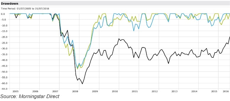
Maximum drawdown
This is the largest cumulative ‘peak to trough’ decline in an investments total value. This provides an indication of the extent to which investors may have to tolerate drawdowns.
This is a great metric to be used alongside others as well as with qualitative research. If a manager preaches capital preservation and protection in poor markets, you would expect the maximum drawdown to be below that of the benchmark.
With regard to these investments, they have a similar maximum drawdown (over the global financial crisis) that is lower than that of the benchmark, which is a pleasing trait. The only slight difference between the two is the period over which the drawdown was obtained. Eleven months for the blue investment and 13 months for the green. However, this is almost not visible to the eye when looking at the chart.
Rolling excess returns
This involves looking at the pattern of returns achieved above the benchmark over a period of time.
Obviously, a time period needs to be chosen over which to analyse the rolling returns. In the chart below, the time period is three years. This should be a long enough period to capture differing economic conditions and market cycles. However, there is nothing wrong with using additional time periods to further aid the analysis.
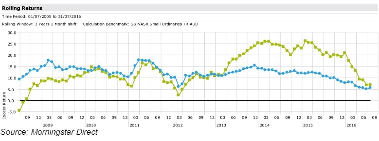
As can be seen in the chart above, both funds have consistently outperformed their benchmark over a long period of time. What can be observed by comparing the two lines is that the outperformance of the blue line is more consistent than that of the green line.
Summary
There are numerous statistical measures that can be used to analyse the performance of investments. It must be noted that this is only a selection of the full suite of tools. The information ratio, the Sharpe ratio and tracking error are others that have not been discussed that you may have heard of. In addition, other data needs to be looked at, such as attribution analysis (e.g. how returns have been composed), as well as the style of the manager, and naturally, information on fees and funds under management, need to be considered.
The process is as much art as it is science but these tools are certainly helpful in identifying quality investments for inclusion in robust portfolios.
Patrick Malcolm, partner, GFM Wealth Advisory


